Mobile Experience · WooCommerce · 2025–2026
Steve Jobs had one obsession that ran through everything he built: remove the thing standing between a person and what they’re trying to do. No unnecessary steps. No confusion. No moment where the user has to stop and think.
He never ran an ecommerce store. But if he had, the first thing he would have done is open it on a phone.
Because that’s where your customers are. Right now. While they’re commuting. While they’re waiting for their chai to cool down. While they’re standing in a competitor’s store, looking up your product on their screen, deciding whether to buy from you instead.
And if your store makes them zoom in to read the price, or accidentally tap the wrong button, or wait four seconds for an image to load — they’ve already made their decision. It just wasn’t the one you wanted.
The uncomfortable question
Mobile-first stopped being a trend around 2019. We’re now in the era where mobile-broken is a business problem.
For most WooCommerce stores, more than half of all traffic comes from mobile devices. In some categories — fashion, food, lifestyle, local services — that number is closer to 70–80%.
So here’s the question worth sitting with: if 70% of your visitors are on mobile, and your mobile experience is an afterthought, what does that mean for your actual revenue?
The good news — and this is real good news — is that mobile optimization isn’t a rebuild. It’s a series of fixable things. Some of them take an afternoon. And each one compounds.
So here’s the question worth sitting with: if 70% of your visitors are on mobile, and your mobile experience is an afterthought, what does that mean for your actual revenue?
“It’s not ‘how should we optimize for mobile?’ anymore. It’s ‘how much are we losing every single day by not having done it yet?'”
The good news — and this is real good news — is that mobile optimization isn’t a rebuild. It’s a series of fixable things. Some of them take an afternoon. And each one compounds.
What mobile users actually want
Your desktop customer has time. Your mobile customer has a mission.
This is the insight that changes everything about how you think about your mobile store.
A desktop shopper might browse casually, compare five products, read the full description, maybe open a few tabs. They have a mouse. They have a big screen. They’re comfortable.
A mobile shopper is usually doing something else at the same time. They have a specific thing they’re looking for. They’re moving fast. The moment something slows them down or confuses them, they’re gone — not because they’re impatient, but because their context doesn’t allow for friction.
“Design for the person on the go, not the person at a desk. Those are two completely different humans having two completely different experiences of your store.”
What the on-the-go customer actually needs: a page that loads before they lose interest (under 3 seconds — that’s the real benchmark now), product images that are clear on a small screen, a checkout they can complete with one thumb, and payment options they already trust.
What kills the experience every time: images that take forever to load, buttons too small to tap accurately, pop-ups that cover the screen and have a tiny X in the corner, forms asking for information that isn’t necessary, and surprise fees appearing for the first time at checkout.
None of these are design philosophy questions. They’re fixable decisions.🔗 [INTERNAL LINK: WooCommerce checkout optimization / reducing cart abandonment]
The SEO angle nobody talks about enough
Your mobile experience is now your search ranking. They’re the same thing.
Google moved to mobile-first indexing a few years ago. Which means the version of your store that Google evaluates, crawls, and ranks — is your mobile version. Not desktop.
But in 2025 and 2026, there’s a second layer to this that’s becoming just as important.
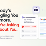
AI-powered search — Google’s AI Overviews, ChatGPT browsing, Perplexity, and others — surfaces recommendations based on how well-organized, trustworthy, and clear your content is. A slow, cluttered mobile experience doesn’t just frustrate customers. It signals to search systems that your site is low quality.
“In 2026, mobile optimization and search visibility aren’t two separate tasks on your to-do list. Fix one, and the other improves with it.”
Clean structure. Fast load times. Content that answers real questions rather than just describing features. These things work together. And they all start with the mobile experience.🔗 [INTERNAL LINK: WooCommerce SEO / AI search optimization / structured data]
Mobile vs. app — settle this once
You don’t need an app. You need a mobile website that works like one.
This comes up a lot. “Should we build an app?”
For most WooCommerce stores — especially those still growing — the answer is: not yet. And here’s why.
An app requires someone to find it in the App Store, download it, create an account, and then remember to open it the next time they want to shop. That’s a lot of commitment to ask from someone who hasn’t bought from you more than twice.
A great mobile website, on the other hand, is already there the moment someone clicks a link from Google, Instagram, WhatsApp, or an email. No download. No friction. Just the store, immediately.
Apps make sense once you have a loyal, returning customer base that shops with you regularly. Until then, every hour spent building an app is an hour not spent making your mobile website actually good.
Get the website right first. The app conversation can wait.🔗 [INTERNAL LINK: WooCommerce omnichannel strategy / repeat purchase optimization]
Do this now
A 10-minute mobile audit you can do before you finish reading this.
Open your store on your phone — not a browser preview on your laptop, your actual phone on your actual mobile network. Then ask these questions honestly:
- Did the homepage load in under 3 seconds?
- Can you read the product descriptions without zooming?
- Are the buttons big enough to tap without mis-hitting?
- Is the navigation simple enough to use with one hand?
- Can you add to cart and reach checkout in under 4 taps?
- Are shipping costs visible before the final payment step?
- Does the checkout offer at least one payment method you’d use yourself?
- Is there a guest checkout option — or are you forcing account creation?
- Can a customer contact you in one tap from any page?
If you answered “no” to even two of these, you’ve just found where your mobile revenue is leaking.
Fix those two things first. Then come back to the list.🔗 [INTERNAL LINK: WooCommerce navigation & UX / mobile payment gateways]
The real lesson Steve Jobs left behind wasn’t about design. It was about respect.
When you build something that works effortlessly, you’re telling the person using it: I thought about you. I considered your time. I removed the things that would have made this harder than it needed to be.
That’s what a great mobile experience communicates to a customer before they’ve read a single word of your product description.
It says: you’re in good hands here.
And in a marketplace where customers have seventeen browser tabs open and a competitor is one swipe away — that feeling is the difference between a bounce and a sale.
Mobile is the foundation. But it’s not the whole story.
Once the experience works on every screen, the next question is: are the right people finding you? And when they do, does your store convert them? That’s what the rest of this series covers.
🔗 [INTERNAL LINK: WooCommerce Part 1 — Foundations / Part 2 — Personalization & Growth]


Leave a Reply